Monday, 8 October 2012

Threshold 2012 Newport Documentary Photography

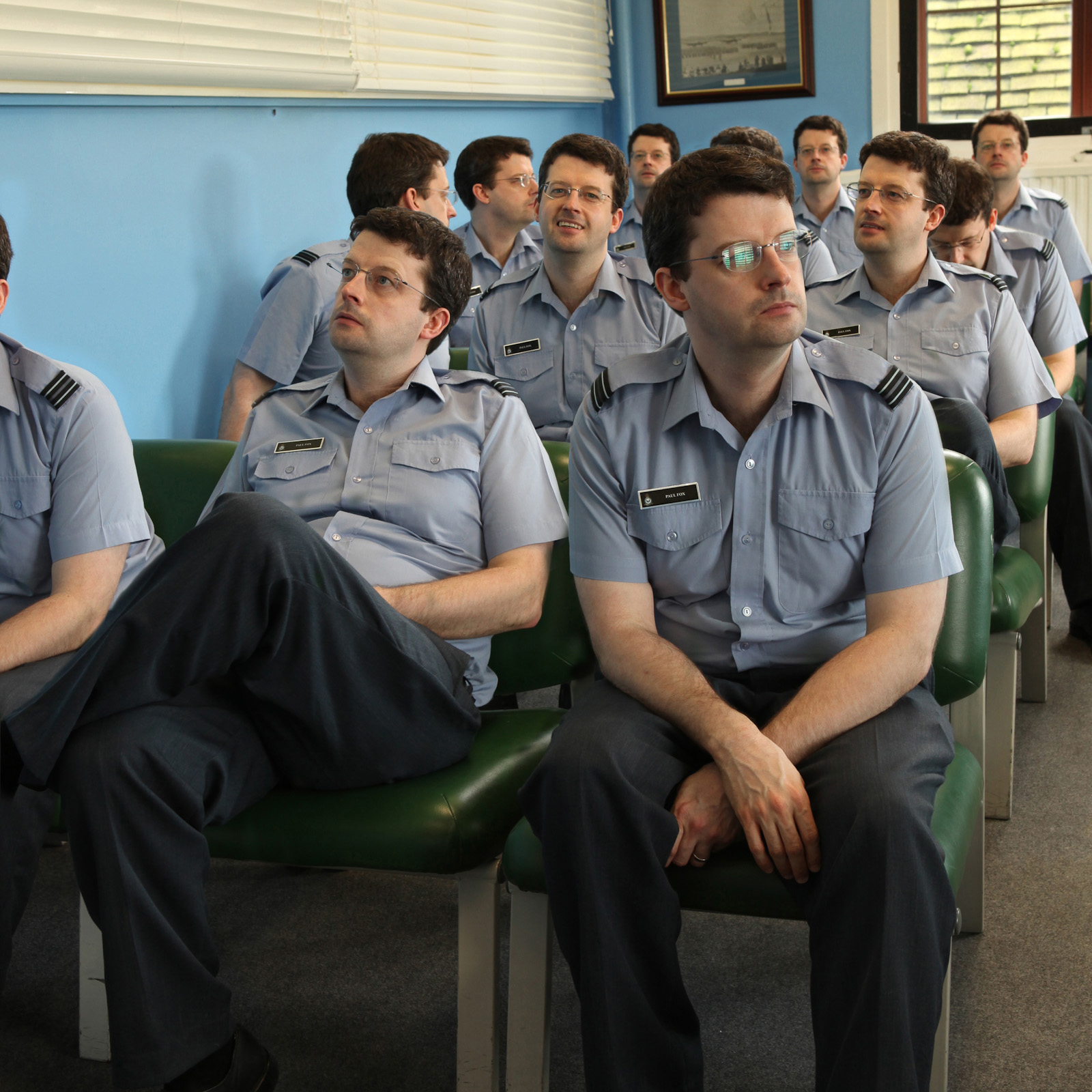
Some of the gallery space for Threshold 2012


I had a busy time this weekend and it was all photography based.   I spent the morning getting shown around Swansea Metropolitan University as a potential student and then finished off with an afternoon at an exhibition by final year Documentary Students from Newport University.

Threshold 2012 is an exhibition being held in Newport's Riverfront Theatre and Arts Centre from Friday 5th October until Saturday 13th October.  If you are in the area and have a chance to get down and visit then I would highly recommend it.

The exhibition brings together the works of 25 final year Documentary Photography students.  The student's have to plan and organise the exhibition as part of their course, and the works are a response to a brief set in the 'Conceptual Documentary' module.  Each of the images has a deeper meaning and when you arrive at the exhibition you are given a useful guide that explains what the images are about.

As I made my way through the exhibition I looked at the images first without the guide, this meant I got an overall feel for each image and could make up my own ideas about what it stood for.  By looking at the guide I could then see if I was anywhere near the photographer's intent.  Usually I was way off the mark or failed to read fully into the image but it was a fun experience nevertheless.

Some of my personal favourites from the exhibition are shown below with selected text from the accompanying guide.


James Kieran: What Makes you Happy

These images were taken in locations where James once met his dates.  He set the exposure time to match the amount of time he spent thinking about his lover (ranging from three to eight minutes!).  In the book of the work the images are accompanied by text from his personal diary - an addition which personally I found detracted somewhat from the strength of his images.  I originally thought that the text was supposed to fit into the blank spaces beside each of the images but apparently this was actually just a deliberate framing technique by the photographer.  There is a strange simplicity to the images and the lack of an obvious narrative in the exhibition meant that my interpretation of this series was completely wrong (I was going with childhood dreams and nightmares).

Dimitra Kountiou:  Disindustrialisation
I was drawn to Dimitra's images as they reminded me of my own work capturing shots of abandoned shops.  Dimitra grew up in Greece and returned there to take pictures of an area that was once a thriving commercial and industrial complex.  For me this was once of the more traditional Doc Photo series and was far less conceptual than some of the others.  I thought that the display technique was interesting as you had to stand back to look at the main image, but were then forced to step 'into' the display to see the smaller pictures.  The series wasn't strong enough to stand as a typology (but I'm a lover of typologies) but the differences in each chosen location meant that I didn't get bored.  It is interesting to see how the effects of the recession have been so universal - these shots could have been taken almost anywhere in the USA or Europe.

Christian Fowler: Suspension
For me this series was the strongest emotional piece on display.  Christian's father had died six years ago and this work looks at the way that memory can fade over time.  An old photo of his father was frozen inside a huge block of ice.  The ice was placed in different locations around his home, his dad's favourite chair, in bed beside his mother and so on.  As the series progresses the ice melts and shrinks in size until all that is left is the original photograph.  The book that Christian made of these series was really strong and the images were beautifully captured - I particularly liked that there was sympathy for the subject, but that he was not afraid to show the imperfect details of his home.


Daniel Wallace: Bus
This was my favourite single image from the show.  I have a strange attraction to images with clean lines, muted colours and a sense that that subjects have had their image 'stolen' from them.  Daniel's series looks at how bus stops become part of their environment and can become a sense of focus for the micro communities that form to use them.  I'm not sure about the bulldog clip hanging technique though (you can see several of the series were displayed this way from the first picture in this post) - I felt that this was definitely a series that warranted some expensive mounts and frames.


Ciaran Woolcombe: Surrounded
I love street photography, it's my current favourite pastime, and I often take snaps of abandoned rubbish.  I was therefore delighted to see that this was the sort of thing that final year student's were also filling their time with.  Ciaran's work aims to show how our everyday lives are spent surrounded by multinational global corporations.  Combined with this is the fact that commerce and capitalism pushes us to discard items that we see as 'rubbish' in the pursuit for newer items.  Ah, candid snaps and rubbish - heaven :)


Luke Santilli: Inzanagi and Inzanami

My favourite series of the exhibition was Inzanagi and Izanami by Luke Santilli.  This was a very conceptual series that is intended to show how everything is in a constant state of flux.  I didn't take a photo of the actual display (doh!) and so the image shown above is taken from the Threshold website.  Unfortunately this screen version doesn't do justice to his work, as the printed version was just amazing.  It looked like a stylised abstract painting and the colours were really eye catching.  There is just enough detail in each of the images to have an idea of what the subject matter is, but you had to get up close to see what was going on.  The thing that really made this series was the printed book that accompanied it.  The book uses a Japanese bookbinding technique to give it a real hand-crafted look (like the book in the link).  The pages inside were not your typical shiny white but instead had a variety of textures.  Some of the pages that contained text were printed on a transparent paper and it felt like I was holding an artists precious diary.  The catalogue that comes with the exhibition has the details of all the photographers and through it I managed to contact Luke and order a copy of his book - I'm going to surprise myself with it on Christmas morning :)


I cannot finish this post without saying a massive thank you Denise Fotheringham who was kind enough to talk to me for a good half an hour about the different work on display.  More importantly she told me loads about the Documentary Photography course at Newport and allayed a lot of my niggling worries about the content and relevance of the course.  She was a great ambassador for the University.


Thursday, 4 October 2012

Book Review: Loretta Lux - Imaginary Portraits

After the type heavy post earlier this week I thought I'd keep it much lighter today.  My latest book purchase arrived in the post yesterday and so it seems a perfect time to do a quick review of Loretta Lux: Imaginary Portraits published by aperture books.  It was first published in 2005 and it is still easy enough to get hold of first editions - I got mine on amazon for under £20.

Loretta takes portraits of children and digitally manipulates them to create seemingly otherworldly images.  It feels like she is trying to create an almost storybook feel to her subjects and many appear to have been cut out and placed on a new background.  The heads seem out of proportion to the body size and the eyes are frequently enlarged to make then an irresistible focal point.

All the images in this post are copyright Loretta Lux and you can find more of her work on her portfolio website HERE

As you look at the images below you need to be aware that they lack the subtle colour range that is present in the book.  It is definitely a case of the printed version being far superior to the on screen version. The 96 pages of the book have a high quality semi-gloss feel to them and the layout of the images on the pages is pleasing with the text being smaller and unassuming.  The book opens with an interesting essay by Francine Prose that discusses Lux's work and her inspirations as well as talking about the images themselves

Almost all of the images are of children but towards the end of the book this is an image of a hunter and his dog.  It feels very out of place amongst the images of children and I'm curious as to why it was included in the collection - if you own the book or are aware of the series I'd be glad to hear your thoughts on it.

Study of a Girl 2, 2002


loretta-lux_8
Study of a Boy 2, 2002


loretta-lux_3
The Walk


back/zurück
The Bride


Monday, 1 October 2012

Tutorial: A Severe Case of Flooding


My first ever blog post had a picture of me staring out of my window in wonder at a underwater world as shown above.  I've had a few people ask me how I managed to create the image and so I thought I'd share the technique with you.  I actually created the original image using Lightroom 4 and Photoshop CS5, two programs I'm very familiar with, but these are expensive and not everyone has access to them.  In order to give you all a chance to try out this tutorial I used the free, yes free, photo editing program called GIMP.  This stands for the GNU Image Manipulation Program although typing GIMP into your search engine may get some interesting results if you aren't careful :)  The program is about 70Mb in size and should run on most PCs.  I don't know if there is an Apple equivalent but I'm sure someone will comment and let me know.

Once you have the program open you need to open an image.  In the following tutorial I used one of me staring out the window.  If you would like a hi-res copy of my original image then contact me and I'll send you a copy so you can use it alongside this tutorial.

I have created my first ever Youtube tutorial to accompany this blogpost.  You can find it below, sorry about all the zooming in and out, I'll do better next time :)  Each of the stages is covered in more depth by this post.


This starting image is clearly lit by normal light and so the first thing that needs to change is the hue of the image.  So go into the menu bar and select Colors / Color Balance.


By changing the quantity of Reds, Green and Blues it is easy to give the image an underwater colour cast.  I used the settings of Red -20 and Blue +30 and did this for the Shadows, Midtones and Highlights (click the little buttons and slide the tabs for each one).  Make sure that 'Preserve Luminosity' is ticked or it will all go wrong.


The next thing to do is to add the aquarium picture.  I found this image by typing "Georgia aquarium" as it is one of the biggest aquariums in the world!  Filter the results to only show 'large' sized pictures and try and choose an image that has plenty of area uncluttered by human tourists so you have lots to work with. The image I used can be found HERE and all copyrights remain with the photographer.

Once you have found a suitable image and downloaded the full size version to your computer then you need to add it to your window picture and so you must create a New Layer by going to Layer / New Layer.  Choose 'Transparency' as the fill type.  Think of it as adding a sheet of tracing paper over the image so you can work between two pictures at once.


Go to File / Open and open the aquarium image.  It will open in a new window and may appear behind the working window.  In the aquarium picture go to Select / All and then Edit / Copy.  This will copy the image and have it ready in your clipboard.  You can now close the Aquarium picture, no need to save if it prompts.


Go back to your window picture and select Edit / Paste and you should end up with something like this.  As you can see GIMP has shrunk the image to fit inside the canvas of the original window picture.  If you look at the top left of the screen you will see a grey bar that says 'Opacity'  I've set the slider to 65% so that I can make out the original picture - this will make the next few steps much much easier!


The aquarium doesn't fill the space taken by the window frames and so I need to resize it.  By using the 'Move' and 'Scale' buttons highlighted below by the red circle I have stretched the image and positioned it so that none of the people are in the spaces occupied by the windows - my big nose covers the arm of the man taking a picture in the bottom left of the frame!  Note that when you are actually scaling the image the opacity will set to 100% so some guess work is involved.

I also found it easier to zoom in on the picture for more accuracy and this was done by clicking on the small % sign at the bottom of the page (just below the man).  Better still if you hold Ctrl and scroll the middle mouse wheel up/down you can zoom in and out really easily.  You will need to zoom in/out a lot in the later stages so get used to this control now.  If you want to move around the picture when you have zoomed in then just press and hold the spacebar.


I'm happy with the position of the fish and so want to make the layer 'editable'.  First of all you need to return the opacity to 100% as shown in the top right hand circle.  Now you need to stop the image being 'floating' and thus uneditable.  You need to 'anchor' the image (boy did this take me a while to realise!).   All that is required to do is click on the Anchor icon shown in the bottom right hand red circle below. 


Now the fun bit.  The aquarium image is sitting in it's own layer but even if we make it see-through it still goes beyond the edges of the window frames in the original picture.  What we need to do is 'rub out' all the bits that aren't necessary.  We could use the eraser tool but this is actually a very inefficient way of doing it.  If you use the eraser and make a mistake then the pixels are lost.  What we are going to do instead is create a Layer Mask.  Go to Layer / Mask / Add Layer Mask.  When the dialogue box opens select 'White - Full Opacity'.


Very little will appear to have changed but you are going to see something amazing in a moment.  Go back up to the Opacity slider and knock it down to about 60% so that you can see the window frames and the aquarium.  We are now going to get rid of the bulk of the spare pixels by masking them out.  Zoom in to 50% and use the spacebar to get the top left pane of the window into view.  Now you need to select the Path tool (shown in the small red circle in the picture below).  You might think that a rectangle selection would be better but it would be rare for the shot to be exactly straight so the pen is far mightier...

With the Path tool selected you should see a Tool Options panel open below all the icons (shown in the large red circle below).  The button marked 'Design' should be selected and you need to tick the 'Polygonal' box.  Now click on one of the corners of the window frame.  Make sure you click just slightly inside the frame and not in the 'garden' side.  Once you have clicked on all four corners click on 'Selection from Path' under the 'Polygonal' box you ticked earlier.  You should now have a box of 'marching ants'.  Now move over to the next window frame and holding down the Shift key press the left mouse button once.  This will add your new clicks to the current selection.  Let go of Shift and click around the corners of the frame just like you did the first time.  Once finished press 'Selection from Path' again and you should get rewarded with another box of marching ants.  Do this around all seven window panes.  You have to guess where the bottom lefthand window finishes but you want to try and have straight lines - if you keep the left button pressed after you have clicked you can drag the line.


Once you have selected all the windows you can make some fine tune adjustments.  A bit of time spent at this stage will stop you pulling your hair out later.  Zoom in and check that none of the ants are marching in the green areas of the garden.  If they are then left click once on one of the corners you made and drag it carefully into the dark area of the frame.  Once your lines are all in the dark areas click again on 'Selection from Path' and the screen will update.  Now for some rubbing out :)

The only pixels you can rub out are those inside the boxes you have just drawn.  That is the opposite of what we need so we need to Invert the mask.  This will protect the aquarium pixels in the window.  Go to the menu and choose Select / Invert (or press Ctrl + I).  Nothing will look different but the next step will tell if you've done it right.

Select the Brush tool, shown in the left hand circle below.  In the tools panel that opens at the bottom pick a decent sized brush, I clicked about a third in on the Size bar and got a figure of 356 pixels.  Make sure you zoom out your picture (I chose 25%).  The brush should default to the colour black.  Where ever you apply black to the Layer Mask the aquarium picture will vanish.  You can wave the brush all over the place and, if you've done it correctly, none of the water inside the window frames will be effected - as shown below.  You may find it helps to increase the opacity so none of the blue escapes you.  In the red circle in the right of the screen shown below you should notice a black pattern forming as you draw.  This is a thumbnail of the Layer Mask you are creating. 

Remember that BLACK REVEALS the bottom layer and WHITE CONCEALS the bottom layer.


Once you have finished, and it should only take a few seconds, you should have a picture and Layer Mask icon that looks like the one below (although I've added a blown up version so you can see better).  It doesn't look too bad at this stage.  The top four windows are complete.  If you notice any green bits sticking out in these windows you need to fix these in the final clear up stages later.  

I deliberately left clutter on the window sill so that it can be used to create a feeling of depth in the image.  We are going to mask out the candles, tankard, and my face so that it looks like the aquarium is behind them.


Time to get rid of the marching ants, go to 'Select / None' in the menu.  Zoom in on the window with the candle and Pritt stick.  Chose a very small brush size, I went for 23 pixels, and with a black brush carefully 'colour in' the detail of the candle back in again.  If you accidently reveal too much of the bottom layer ie get some of the green garden showing like a halo around the objects then you need to change to a white brush to conceal the layer.  This is why you went to the effort of making a mask and not just used the eraser tool.  You can quickly flip the white/black colours by clicking the small arrow next to the colour blocks (shown in the middle circle below).  

In the image below I've already done the candle and have started on the Pritt stick.  As you get closer to the edge of the object you may want to decrease the brush size - this can be done quickly by using the [ key and ] makes it bigger again. Remember if you make a mistake there is no need to worry, change your brush colour back to white and the water pixels can be painted back in.  


When you get to the scissors take extra care with the handle.  By only painting back the red bits you can leave the aquarium showing in middle, the same applies to the punched holes in the top of the pen refill boxes that are sticking out of the tankard.  Take care when painting between the pencils.  Zooming right in and using a small brush, as shown below makes this relatively simple.


Now for an extra touch.  When you get to my face you'll notice I'm wearing glasses.  Wouldn't it be amazing if you could see the aquarium through the glasses!  Its actually pretty simple.  All you need to colour in is the arm of the glasses and the darker curve of the edge of the lens to make a sort of T shape.  I zoomed right in to get the detail right and used a tiny brush to draw to a point as shown below.


Nearly done.  Once you've finished the tankards, candle, cigar box and my face you should zoom out and admire your handy work.  You've been working at an extreme magnification and it helps to stop and step back every now and then to check the overall effect is working.  You should have something that looks like this, reasonably neat edges around the windows and the aquarium visible in the cardboard holes, scissor handle and through my glasses.


Now its time for your final checks.  Zoom in and inspect around the edges of each window frame.  Even with careful selecting with the pen tool you may have missed a few pixels, as I have shown below, and have a thin strip of grass showing through.  Using the brush on a very small setting you can colour in the missing bits of aquarium - remember that you will have to use a black brush to reveal the window layer, a white one to conceal it.  If you have overrun too much into the window you can use the Pencil tool to 'draw' straight lines to tidy up the edges.  With a small brush left click once at your starting point.  Press and hold the Shift key and you get a moveable line that you can drag along to the required position.


Once you've finished all of your editing you must remember to turn the aquarium layer opacity back up to 100%


With the editing complete you need to make the image ready for saving.  In order for GIMP to remember the layers and masks you need to click on File / Save and it will ask you for a filename.  GIMP uses the .xcf format.  If you want to be able to share your images or save it as a smaller file then you want to convert it to a JPEG.  The .xcf for my picture was 34Mb in size but the .jpg got it down to 1.4mb (you can go smaller by reducing the quality further).  

The conversion option is hidden away (it took me a few internet searches for the answer) but want you need to do is click on File / Export from the main menu.  You get a screen similar to the one shown below.  If you click on the small + icon near 'Select File Type', shown in the small red circle, you get all the compatible formats that GIMP can work with.  Scroll down until you see JPEG Image as shown.  Type in your filename in the top box and hit 'Export'.  And relax.  


Congratulations on making it to the end of the post!  If you are a novice to photo editing and you've followed along with me then you've learnt an amazing amount of techniques:

Open an image adjusting the colour balance
Adding a layer
Importing an image into a layer
Scaling and Moving an Image Layer
Changing Opacity and Anchoring 
Creating a Layer Mask
Making a selection using the pen tool
Inverting a Selection
Using the brush tool in black or white mode to add /subtract to the mask
Zooming in an fine tuning 
Exporting your image

The techniques you have learnt will stand you in good stead for future projects.  Advanced use of these skills mean you can  produce images like this one, taken one quiet afternoon at work and created in about an hour in Photoshop from 12 different shots :)


Tuesday, 25 September 2012

CreativeLIVE - the world's best photography classroom!

For this post I thought I'd share with you one of the best online photography education sites out there,  creativeLIVE.  Based in Seattle, this company provides free online training for photographers, film makers, web designers and much more but the bulk of it's content is for photographers.  Each week they have an industry leading professional come in to their studio and they stream the work shop live and for free.  The workshops can last from a few hours up to mammoth 5 day events.  Not everyone has hours free each day to watch these work shops and so creativeLIVE makes the files available to download.  These files cost money to download but if purchased prior to, or during the workshop, there is a good discount.  For a three-day workshop (the typical length) the cost is $79-$99 for pre-orders and then $149 after the event.  The video files are all released in HD and are broken down in to chapters - great for jumping straight to the section for complicated bit you wanted to look up.  Occasionally creativeLIVE will have special offers and give discounts on some of their older courses so following their twitter feed @creativeLIVE makes sense.

Some of the courses that I've seen and are worth a look are listed below.  The images are screen captures and so any links there don't work.  I have provided a link to each workshop after a brief description of what you get for your money:

Jasmine Star Wedding Photography


This is a five day workshop that covers almost everything about wedding photography.  Jasmine is one of those really annoying happy American photographers but she is enthusiastic about her work and her tutorials contain loads of great information.  Her style of wedding photography has the american slant and is more the reportage style that is slowly gaining popularity here in the UK over the line up and grin pictures that are traditional.  The course covers subjects that include branding, second shooters, shooting during the ceremony, lighting, posing, working with groups and what to do after the wedding.  The six students on the course are taken to a set-up wedding and talked through everything and then, for one of the sessions, all their images are worked through by Jasmine.  You can find details on the workshop HERE.


Sandy Puc Babies and Bellies


So once you've done the round of wedding photographs then some time later your friends will start having kids and will be looking for a photographer to help them out.  This next workshop is a three-day affair that covers how to shoot from pregnancy to one-year old babies.  As with many of the creativeLIVE workshops the first day is taken up with business information and tips for actually making some money from your work.  It then covers twelve different actual 'live' shoots with babies of different ages and talks through all the different posing, lighting and baby wrangling techniques to create some brilliant images.  With only a few bits of inexpensive lighting equipment she shows how you can build a mini-studio at home to recreate some of the effects.  Sandy's workshop is HERE


Jared Platt The Ultimate Lightroom Workflow


If you still think you need Photoshop to sort out your images then you have obviously never some across Adobe Lightroom.  I was a real sceptic when I was introduced to this software as it just seemed to be a big database for my pictures.  The more I learn about Lightroom the more amazing I find it.  Yes it is a great way to catalogue and store my pictures but it does sooooooo much more!  It's a powerful image editor, it can apply filters to my images, convert to black and white, store geo-caching information, fix badly exposed images, crop and rotate pictures, fix red-eye, get rid of dust and spots, sort out noise, create books that can be ordered from Blurb, or give me total control over my printing from home.  This workshop is a real must and it delves into almost every function of the software.  Aimed at everyone from the novice to pro user there is something here for everyone and I still refer back to it frequently.  You can find the workshop HERE.


Lesa Snider's Photoshop CS5 Intensive Workshop


Whilst Lightroom is perfect for the majority of photo 'fixing' tasks you did still need software like Photoshop if you need to push pixels around a screen or create special effects (as seen in my first blogpost).  I've been fumbling around Photoshop for several years now but could have saved hours of my life if I'd watched workshops like Lesa's in my early days.  Some of the images and effects that are used in the videos seem ridiculously basic but it is all about building an understanding of the way that Photoshop works so you can apply the techniques to your own images.  You can find this workshop HERE.  Her workshop is one of the most popular in the creativeLIVE catalogue and she has recently returned for four one-day workshops that go into specific areas of Photoshop in real depth.

If you love Photoshop then you should also check out Ben Willmore's brilliant creativeLIVE workshop HERE.


John Greengo DSLR Fast Start Courses


What if you've always wanted to make the leap from a point-and-shoot camera to a 'real' DSLR with interchangeable lenses?  You take your shiny camera out of its packaging and realise you are entering a world of confusing buttons and dials, abbreviations and incomprehensible manuals so you end up shooting in 'full auto' mode and never unlock your camera's potential.  CreativeLIVE has this eventuality covered too!

They run regular workshops hosted by John Greengo.  Each of the workshops looks at one specific camera  and then goes through absolutely every function in a few hours.  With the video files you also get a pdf handout you can print for reference.  I thought I knew my way round my Canon 5D Mk2 but John really knows his stuff so I bought the workshop to keep in case I ever get a shooting situation I cant figure my way out.  The major Canon and Nikon semi-pro models are all covered and you can find the workshops HERE more cameras are added if a new model is released (and one for the Olympus OM-D EM-5 is available).

And so much more...

I've just touched the surface of the creativeLIVE back catalogue.  They have workshops on studio lighting, shooting fireworks and light trails, creating websites using Wordpress, getting portraits of strangers in the street, running a professional fashion shoot, creating apps for the iPhone, using Illustrator and so much more. New videos are streamed live most weeks from Thursday-Sunday, as I type this John Greengo has been teaching me how to use the Canon 650D - should I ever buy one :) and this weekend is a two day workshop on creating wedding and portfolio albums.

Check out creativeLIVE!


Thursday, 20 September 2012

Astronomy Photographer of the Year 2012

The winning entries for the Astronomy Photographer of the Year2012 have just been announced and so I thought I'd share some of the winning entries with you.  All of the pictures shown here are copyright their respective photographers.  Information has been taken from the Royal Museums Greenwich site.  I'd recommend following the links to each of the photographers Flickr accounts for larger versions of the images.  I've included links to some of the telescopes and cameras used by these photographers - it's a field of photography I knew very little about until writing this post!

M51 Whirlpool Galaxy

This is the winning picture for the 'Deep Space' category and was taken by Martin Pugh.  He used an expensive Apogee camera mounted to an even more expensive Planewave telescope to capture this image of the M51 Whirlpool Galaxy.  The actual image is far sharper than shown here and the detail in the spiral arms is incredible.  Those dots that look like stars are actually other galaxies!  You can find more of Marin's images on his Flickr account HERE

Simeis 147 Supernova Remains

If you ever wondered where all the particles in your body came from the answer is from events such as this.  This image shows the remains of a star that exploded around 40,000 years ago.  The particles are still moving outwards and they now straddle several galaxies.  The photographer Bernal Andreo used a $10,000 combination of a  Takahashi telescope mounted to his SBIG camera to get this image - worth every penny I think.  You can find more of his work on Flickr HERE

The next category is one that everyday photographers like myself might have a chance of entering.  The Earth and Space category is for photos that include landscape, people or other 'Earthly' things along with an astronomical subject.


Ice Starfall

This is my favourite image from this year's competition as it is so full of mood and atmosphere.  Photographer Masahiro Miyasaka took this image in Japan using a Canon 5D Mk2 with a 14mm lens - so no fancy telescopes or complicated equipment.  The frozen ice streaks work perfectly to draw your eye up towards the heavens and the trees help to give a sense of scale.  His Flickr page is HERE.

In the next category I'm sure the runner up must be gutted because I thought his image was way better than the actual winner.  The Our Solar System category is for photos of our Sun and its family of planets, moons, asteroids and comets. 


Transit of Venus

This image by UK photographer Chris Warren was chosen as the winner by the judges because "for me this picture perfectly captures the excitement of the 2012 transit of Venus. After getting up at 4am on a cloudy morning it really didn't look as though the British weather was going to co-operate. But then, with just minutes to go, a gap appeared in the clouds and we got a precious glimpse of Venus in front of the Sun."  Chris has more pictures on his Flickr account HERE

The shot was taken using a Grasshopper camera mounted to a telescope.  I'd never even heard of this sort of camera but a quick search on the internet revealed some clips of it in action.  The clip below is, I'm assuming, a shot of the Sun in 'action'.  Sorry about the music!


Now for one of the highly commended shots in the same category - also taken of the transit of Jupiter past the Sun.


Venus Transit

This shot made me mouth a silent 'Wow'.  It's by Australian photographer Paul Haese and was constructed by using a mosaic shooting technique.  This uses the camera to capture a small area in great detail.  The photo is then pieced together with other shots, like a jigsaw, to create one large image.  This was made from 6 panels of images with each panel containing 750 photos!  Paul is clearly a keen astronomy photographer and his Flickr page shows entries for some of the other categories HERE.


The next category is the one that makes me green with envy as it is the Young Astronomy Photographer category.  It's sickening how much talent these young men, and all the prize winners were men, have already got.


Pleiades Cluster
I couldn't find a link to the photographers website so you'll have to settle for this screen grab.  Jacob von Chorus, a fifteen year old from Canada, took this using a Skywatcher Telescope with a Canon 100D Camera mounted on the end.  He used a total of an hour of exposure time to build up the picture.  It shows one of the closest star clusters to Earth, the Pleiades Cluster, better known as the Seven Sisters.

The final image here, from the same category, will hopefully provide a kick up the butt for any would be astro-photographers who think you need fancy kit to get impressive results.


Lunar Mountains
If you've ever tried to take a picture of the moon you will know it can be really difficult to get anything decent with even a 300mm lens.  You need a professional telescope and high end camera to get anything interesting.  Jacob Marchio, 13, took this with a budget level Orion Astroview telescope similar to this one, and a Canon Powershot SD1300!  

I was given a telescope not too dissimilar to the Astroview for Christmas a few years back.  I think it's time I got it out of the cupboard, dusted it off, and got a mount to fit my Canon 5D to it :)


Congratulations to all of the winners.  If this article has whetted your appetite for astronomy photography and  you would like to see more images then go to the competition result page at Royal Museums Greenwich

The BBC news pages have picked up on the story and there is a short video about the entries HERE


Monday, 17 September 2012

Essential iPhone Camera Apps

A few people have asked me what camera apps I use on my iPhone and so I thought I'd compile a list of my 10 most used Camera Apps.  I've included apps that change the way images are captured, apps for editing your images and two really useful little apps that will help lighten the load of your kitbag.

Camera+ (69p)


Camera+

If you only buy one camera app for your iPhone you need to get this one.  The current inbuilt camera app that comes with your phone is fine for normal use but this adds extra functionality.

Like the normal iPhone camera you can point on the screen to select a focal point.  This app adds an extra step - if you hit a small cross that appears near the focal point you can bring up a second aiming point.  This point can be moved around the image to determine which spot it takes a light meter reading from.  The overall image is then adjusted based on this point.  This works really well when dealing with tricky lighting situations like portraits against a window, or particularly bright/dark scenes.  You can also lock these points, or lock the white balance, based on the live meter readings.  It also has a stabilizer function - not an actual stabilizer but it will only take a picture when the camera is held steady.  There is also a burst mode and a timer mode, both very useful.

If that was all I'd still recommend the app but there is a second part to the software and that is an editing suite.  You can use the 16 presets to quickly alter an image for the style of photography. Settings include backlit, cloudy, night, portrait and my favourite - clarity (a subtle version of HDR).  There is also a wide selection of filters divided into Color (it's American!), Retro, Special and I Love Analog.  Retro filters replicate amongst others toy cameras, lo-fi, antique and Lomographic.  Special effects has nine modes including a full HDR mode, Color Dodge, Depth of Field and Miniaturize.  The I Love analogue filters cost an extra 69p to buy as a download and replicate nine old style cameras and film types such as Pinhole, expired (film) and Diana.  Each of the filters has an opacity slider and this gives even more control over the filters.  There is also a selection of nine adjustable borders that range for simple white/black borders to film sprockets and grungy torn edges.


Instagram (Free)


Instagram

Ah, the bane of my life but also a great app when it isn't used for evil, and by evil I mean pictures of feet, kittens or clouds!  This is primarily a photo sharing app.  It is fast replacing Flickr as the depository for the millions of images captured each day.  Instagram has become part of the war between Facebook and Google+ for dominance of the social media market.  Facebook acquired Instagram and Google+ bought out Snapseed (discussed later).  This app has also changed the way that people visualise images - rectangular shots are so last year, pictures are square shaped these days!  Every image created by this app is square, you can import an image from your camera folder but before you publish it must be cropped into a square format.

Instagram lets you capture images using settings similar to the default camera app.  Once it has an image the image editor kicks in, and this is where the strength of the app comes in.  You can auto adjust image settings to get the best exposure with just one click.  Before you start messing with your images you can chose a spot to be in focus and it will blur out the rest of the image (lots of control options over what is blurred/sharp).   It isn't just the traditional tilt-shift look as it also has the option to apply the effect as circles.  There is also a total of 18 preset filters that give a wide range of looks from 70's cameras to Black and White.  Some of the filters include borders and these can be turned on/off as required.  There is nowhere as much control as Camera+ but there is still a lot of variety in the filters.

As I mentioned earlier this is a photo sharing app and there are loads of options for getting your image out into the world wide web.  With a few screen presses you can send your images to email addresses, Flickr, Twitter, Tumblr, foursquare and of course Facebook.  You can also create a photo map that records where all of your images have been captured - a great way of recording your exact location whilst on holiday for example.

Filterstorm (£2.49)


I believe this is the most powerful photo editing app available on the iPhone and it even beats Adobe's Photoshop Express app for its functions.

Once you have loaded an image into the software you have dozens of tools available to you in an easy to use menu system.  In the crop menu for example you can crop as normal, scale to fit an exact ratio, straighten an image, add borders, make it square or change the image size with pixel accuracy.  Other menus open to change exposure, hue/saturation, white balance and shadows/highlights.  All standard stuff so far but there is much more!

This is one of the few apps that lets you have different layers, have layer masks, use curves (luminance, RGB and CMY), and save your favourite settings as one click actions.  Best of all it has multiple 'undo' options for when mistakes are made.  If it all sounds daunting then don't be afraid as everything is controlled through sliders.  If you are not sure what a feature does just whack the slider up to 100% and see the extreme version, you can then back it off to get the effect you are after.  You can even split the screen in two and compare the effect alongside the original.  If you aren't happy then just click the big red X and your image is reverted to normal.

I have an iPhone 4 and if I work on an image a lot it can get a little clunky as the processor struggles.  The sharpen image function seems pretty power intensive but it still only takes a few seconds to complete.  Final images can be exported back to the library or emailed and there are further options to determine file size and resolution at this stage.


Snapseed (£1.49)

Snapseed

This is predominately an editing app that uses a wide range of filters to create the final image.  It has thirteen items in its main menu: automatic, selective adjust, tune image, straighten, crop, black and white, vintage, drama (a grainy HDR effect), grunge (dark vignetting, increased sharpness and a subtle background texture layer), center focus (another American app!), frames and tilt-shift.

Each menu opens into further options that give finer control over your image.  The control method is a little unusual but only takes a minute to get used to.  When you select a main category, Fine Tune for example, you are presented with your image and 'Brightness 0' at the bottom.  By swiping your finger left and right on the image you can change the brightness.  If you hold your finger on the screen and move up and down you open more menus, in this case Ambiance, Contrast, Saturation and White Balance.

From the Black and White menu you can control Brightness, Contrast and Grain and have access to yet another set of controls (all using the easy swipe feature).  You can control the effects as a neutral filter or have fine tuning over reds, oranges, yellows, and greens, much like in the traditional darkroom.  Frames can be added to your image before you complete it and there is an option for a randomised 'torn' effect.  The tilt-shift function has more control than most apps but only straight lines can be used (unlike the circle effect available in Instagram).


Adobe Photoshop Express (free)

PS Express

The last of the 'big 5' apps that should be on your phone.  This has been produced by industry giants Adobe in their attempt to spread their dominance of the photo editing market into the iPhone.  This is a free app but to access the full features you will need to pay more money as in app purchases - these unlock camera styles, borders and special effects.  I've purchased all the packs so I can't actually remember what comes with the standard free edition.

The camera function is almost identical to the standard one but also has a 3 and 10 second self timer.  This isn't a capturing app, the power of this software is its image editing.

All the standard basic functions are included: crop, straighten, rotate (in 90 degree increments) and flip.  You can also control the exposure, brightness, hue and temperature from the second menu.  The third menu has control over the pixels with filters like sketch, soft focus, sharpen and reduce noise.  The final menu has the special effects and borders.  There are 61 special effects (really just a collection of filters and presets) and they include things like four types of tilt-shift and six types of black and white.  Amongst them are more fun filters such as postcard, sparkle and my favourite photo-stack.  This last filter cuts your image into lots of smaller ones, like laying a series of polariods over each other or in horizontal/vertical bands.  If you have Filterstorm then you probably don't need this app but I have included it makes the top ten for its easy of use and price.


PicFrame (69p)


This is a much over looked app but it can really add to your images if you want to stand out from the Insta-crowd.  This app allows you to combine several images together in one - like the 'family' frames you may have seen in your local photography/department store.

There are five different ratios available for your final image, 1:1, 3:2, 4:3, 2:3 and 3:4 and all the different 'frames' are available for each ratio.  The makers regularly update the frames and at the time of writing there are 67 in total.  You can control the colour, width and style of the frames and can add labels over the top.  It's the best way of creating a story in a single image and you can have up to nine images in one photo like the one I created in under two minutes as an example HERE (links to my Flickr account).


Slow Shutter (69p)

Slow Shutter

This gives you control over the exposure time for the camera.  The standard iPhone camera will choose the best settings for a pin sharp image and you can happily snap away with those settings.  This app lets you chose just how long you want the shutter open.  The main use for this is creating light trails, an effect that is impossible to create without the app.  You can make rivers look silky smooth, create artistic blurred portraits or take it to the race track for streaking action shots.  If you do start using this app seriously you may need to invest in an iPhone gorilla-pod or tripod as some of the automatic exposure times are as long as 15 seconds.  There is also a bulb mode for those really dark spaces.  I used this app to shoot THIS image in an empty cinema - no other app could cope!


Hipstamatic (free)

Hipstamatic

This app would be rated much higher, but for the fact that too many of the filters need to be purchased once you've bought the basic app package.  The app simulates an old film camera.  When you run the app it shows you the back of a camera with a viewfinder and a slot for a roll of film.  You chose what type of lens, film and flash you want on the camera (a fancy way of saying, pick a filter!) and then can shoot away.  The filters are sold in packs called SnapPaks for 69p each.  The majority of paks have one lens and one film type, for example the Portrait SnapPak has a 'Foxy Lens' and 'Sugar Film'.  An inbuilt help menu gives examples of the components in use and all of the items are interchangeable for some weird and wonderful images.  There are at least ten paks available for purchase at the time of writing so that's £6.90 for the set!


Easy Release (£6.99)

Easy Release
If you want to publish any of your portrait pictures professionally then you may need to have a model release.  This app is an automated system for creating the legal form that gives you permission to use the images.  It may be easier to have a pad of preprinted forms in your pocket but the strength of this app is that it quickly builds to become an electronic database of all your models and automatically emails completed release forms back to your main email account and to that of your model.  I bought this app early and it was pretty cheap but the price is currently £6.99 so it may put casual shooters off.

Before I go out shooting I set up the basic details in the app and then if I need to get a release it takes about a  minute to get everything ready for my model to sign on-screen.  I find that it can add to the shoot and make a non-professional model feel quite special :-)


Pocket Light Meter (free)

Pocket Light Meter
This final app is for anyone who likes to collect and use old film cameras.  I have a handful, and in some of them the photosensor has broken (or doesn't exist).  The Pocket Light Meter app lets you use your iPhone as a light meter.  When you open the app you are shown the live camera image and three scrolling dials that display time, aperture and ISO.  You can set any of these values (I usually use the film ASA and camera aperture) and the app will calculate the missing elements, in this case shutter speed.  I've tested it against the meter in my Canon 5D Mk2 and the results are impressive as it gets it almost spot on every time!  On the downside there are a lot of adverts in this app - it doesn't reduce the functionality at all but they are distracting.


There are many more photo apps on my iPhone and I may revisit this subject at a later date.  Some of my apps have a limited use and have only been used a few times.  Apps worth looking at include Pic Grunger and Photo Studio for editing, Hueless for capturing in black and white, and WordFoto for creating quirky images as it converts your photos to blocks of coloured text.  If you have any great apps that should have been on this list please leave a comment and tell me why I should have included it.