My first ever blog post had a picture of me staring out of my window in wonder at a underwater world as shown above. I've had a few people ask me how I managed to create the image and so I thought I'd share the technique with you. I actually created the original image using Lightroom 4 and Photoshop CS5, two programs I'm very familiar with, but these are expensive and not everyone has access to them. In order to give you all a chance to try out this tutorial I used the free, yes free, photo editing program called
. This stands for the GNU Image Manipulation Program although typing GIMP into your search engine may get some interesting results if you aren't careful :) The program is about 70Mb in size and should run on most PCs. I don't know if there is an Apple equivalent but I'm sure someone will comment and let me know.
By changing the quantity of Reds, Green and Blues it is easy to give the image an underwater colour cast. I used the settings of Red -20 and Blue +30 and did this for the Shadows, Midtones and Highlights (click the little buttons and slide the tabs for each one). Make sure that 'Preserve Luminosity' is ticked or it will all go wrong.
The next thing to do is to add the aquarium picture. I found this image by typing "Georgia aquarium" as it is one of the biggest aquariums in the world! Filter the results to only show 'large' sized pictures and try and choose an image that has plenty of area uncluttered by human tourists so you have lots to work with. The image I used can be found
HERE and all copyrights remain with the photographer.
Once you have found a suitable image and downloaded the full size version to your computer then you need to add it to your window picture and so you must create a New Layer by going to Layer / New Layer. Choose 'Transparency' as the fill type. Think of it as adding a sheet of tracing paper over the image so you can work between two pictures at once.
Go to File / Open and open the aquarium image. It will open in a new window and may appear behind the working window. In the aquarium picture go to Select / All and then Edit / Copy. This will copy the image and have it ready in your clipboard. You can now close the Aquarium picture, no need to save if it prompts.
Go back to your window picture and select Edit / Paste and you should end up with something like this. As you can see GIMP has shrunk the image to fit inside the canvas of the original window picture. If you look at the top left of the screen you will see a grey bar that says 'Opacity' I've set the slider to 65% so that I can make out the original picture - this will make the next few steps much much easier!
The aquarium doesn't fill the space taken by the window frames and so I need to resize it. By using the 'Move' and 'Scale' buttons highlighted below by the red circle I have stretched the image and positioned it so that none of the people are in the spaces occupied by the windows - my big nose covers the arm of the man taking a picture in the bottom left of the frame! Note that when you are actually scaling the image the opacity will set to 100% so some guess work is involved.
I also found it easier to zoom in on the picture for more accuracy and this was done by clicking on the small % sign at the bottom of the page (just below the man). Better still if you hold Ctrl and scroll the middle mouse wheel up/down you can zoom in and out really easily. You will need to zoom in/out a lot in the later stages so get used to this control now. If you want to move around the picture when you have zoomed in then just press and hold the spacebar.
I'm happy with the position of the fish and so want to make the layer 'editable'. First of all you need to return the opacity to 100% as shown in the top right hand circle. Now you need to stop the image being 'floating' and thus uneditable. You need to 'anchor' the image (boy did this take me a while to realise!). All that is required to do is click on the Anchor icon shown in the bottom right hand red circle below.
Now the fun bit. The aquarium image is sitting in it's own layer but even if we make it see-through it still goes beyond the edges of the window frames in the original picture. What we need to do is 'rub out' all the bits that aren't necessary. We could use the eraser tool but this is actually a very inefficient way of doing it. If you use the eraser and make a mistake then the pixels are lost. What we are going to do instead is create a Layer Mask. Go to Layer / Mask / Add Layer Mask. When the dialogue box opens select 'White - Full Opacity'.

Very little will appear to have changed but you are going to see something amazing in a moment. Go back up to the Opacity slider and knock it down to about 60% so that you can see the window frames and the aquarium. We are now going to get rid of the bulk of the spare pixels by masking them out. Zoom in to 50% and use the spacebar to get the top left pane of the window into view. Now you need to select the Path tool (shown in the small red circle in the picture below). You might think that a rectangle selection would be better but it would be rare for the shot to be exactly straight so the pen is far mightier...
With the Path tool selected you should see a Tool Options panel open below all the icons (shown in the large red circle below). The button marked 'Design' should be selected and you need to tick the 'Polygonal' box. Now click on one of the corners of the window frame. Make sure you click just slightly inside the frame and not in the 'garden' side. Once you have clicked on all four corners click on 'Selection from Path' under the 'Polygonal' box you ticked earlier. You should now have a box of 'marching ants'. Now move over to the next window frame and holding down the Shift key press the left mouse button once. This will add your new clicks to the current selection. Let go of Shift and click around the corners of the frame just like you did the first time. Once finished press 'Selection from Path' again and you should get rewarded with another box of marching ants. Do this around all seven window panes. You have to guess where the bottom lefthand window finishes but you want to try and have straight lines - if you keep the left button pressed after you have clicked you can drag the line.

Once you have selected all the windows you can make some fine tune adjustments. A bit of time spent at this stage will stop you pulling your hair out later. Zoom in and check that none of the ants are marching in the green areas of the garden. If they are then left click once on one of the corners you made and drag it carefully into the dark area of the frame. Once your lines are all in the dark areas click again on 'Selection from Path' and the screen will update. Now for some rubbing out :)
The only pixels you can rub out are those inside the boxes you have just drawn. That is the opposite of what we need so we need to Invert the mask. This will protect the aquarium pixels in the window. Go to the menu and choose Select / Invert (or press Ctrl + I). Nothing will look different but the next step will tell if you've done it right.
Select the Brush tool, shown in the left hand circle below. In the tools panel that opens at the bottom pick a decent sized brush, I clicked about a third in on the Size bar and got a figure of 356 pixels. Make sure you zoom out your picture (I chose 25%). The brush should default to the colour black. Where ever you apply black to the Layer Mask the aquarium picture will vanish. You can wave the brush all over the place and, if you've done it correctly, none of the water inside the window frames will be effected - as shown below. You may find it helps to increase the opacity so none of the blue escapes you. In the red circle in the right of the screen shown below you should notice a black pattern forming as you draw. This is a thumbnail of the Layer Mask you are creating.
Remember that BLACK REVEALS the bottom layer and WHITE CONCEALS the bottom layer.
Once you have finished, and it should only take a few seconds, you should have a picture and Layer Mask icon that looks like the one below (although I've added a blown up version so you can see better). It doesn't look too bad at this stage. The top four windows are complete. If you notice any green bits sticking out in these windows you need to fix these in the final clear up stages later.
I deliberately left clutter on the window sill so that it can be used to create a feeling of depth in the image. We are going to mask out the candles, tankard, and my face so that it looks like the aquarium is behind them.
Time to get rid of the marching ants, go to 'Select / None' in the menu. Zoom in on the window with the candle and Pritt stick. Chose a very small brush size, I went for 23 pixels, and with a black brush carefully 'colour in' the detail of the candle back in again. If you accidently reveal too much of the bottom layer ie get some of the green garden showing like a halo around the objects then you need to change to a white brush to conceal the layer. This is why you went to the effort of making a mask and not just used the eraser tool. You can quickly flip the white/black colours by clicking the small arrow next to the colour blocks (shown in the middle circle below).
In the image below I've already done the candle and have started on the Pritt stick. As you get closer to the edge of the object you may want to decrease the brush size - this can be done quickly by using the [ key and ] makes it bigger again. Remember if you make a mistake there is no need to worry, change your brush colour back to white and the water pixels can be painted back in.
When you get to the scissors take extra care with the handle. By only painting back the red bits you can leave the aquarium showing in middle, the same applies to the punched holes in the top of the pen refill boxes that are sticking out of the tankard. Take care when painting between the pencils. Zooming right in and using a small brush, as shown below makes this relatively simple.
Now for an extra touch. When you get to my face you'll notice I'm wearing glasses. Wouldn't it be amazing if you could see the aquarium through the glasses! Its actually pretty simple. All you need to colour in is the arm of the glasses and the darker curve of the edge of the lens to make a sort of T shape. I zoomed right in to get the detail right and used a tiny brush to draw to a point as shown below.
Nearly done. Once you've finished the tankards, candle, cigar box and my face you should zoom out and admire your handy work. You've been working at an extreme magnification and it helps to stop and step back every now and then to check the overall effect is working. You should have something that looks like this, reasonably neat edges around the windows and the aquarium visible in the cardboard holes, scissor handle and through my glasses.

Now its time for your final checks. Zoom in and inspect around the edges of each window frame. Even with careful selecting with the pen tool you may have missed a few pixels, as I have shown below, and have a thin strip of grass showing through. Using the brush on a very small setting you can colour in the missing bits of aquarium - remember that you will have to use a black brush to reveal the window layer, a white one to conceal it. If you have overrun too much into the window you can use the Pencil tool to 'draw' straight lines to tidy up the edges. With a small brush left click once at your starting point. Press and hold the Shift key and you get a moveable line that you can drag along to the required position.
Once you've finished all of your editing you must remember to turn the aquarium layer opacity back up to 100%
With the editing complete you need to make the image ready for saving. In order for GIMP to remember the layers and masks you need to click on File / Save and it will ask you for a filename. GIMP uses the .xcf format. If you want to be able to share your images or save it as a smaller file then you want to convert it to a JPEG. The .xcf for my picture was 34Mb in size but the .jpg got it down to 1.4mb (you can go smaller by reducing the quality further).
The conversion option is hidden away (it took me a few internet searches for the answer) but want you need to do is click on File / Export from the main menu. You get a screen similar to the one shown below. If you click on the small + icon near 'Select File Type', shown in the small red circle, you get all the compatible formats that GIMP can work with. Scroll down until you see JPEG Image as shown. Type in your filename in the top box and hit 'Export'. And relax.
Congratulations on making it to the end of the post! If you are a novice to photo editing and you've followed along with me then you've learnt an amazing amount of techniques:
Open an image adjusting the colour balance
Adding a layer
Importing an image into a layer
Scaling and Moving an Image Layer
Changing Opacity and Anchoring
Creating a Layer Mask
Making a selection using the pen tool
Inverting a Selection
Using the brush tool in black or white mode to add /subtract to the mask
Zooming in an fine tuning
Exporting your image
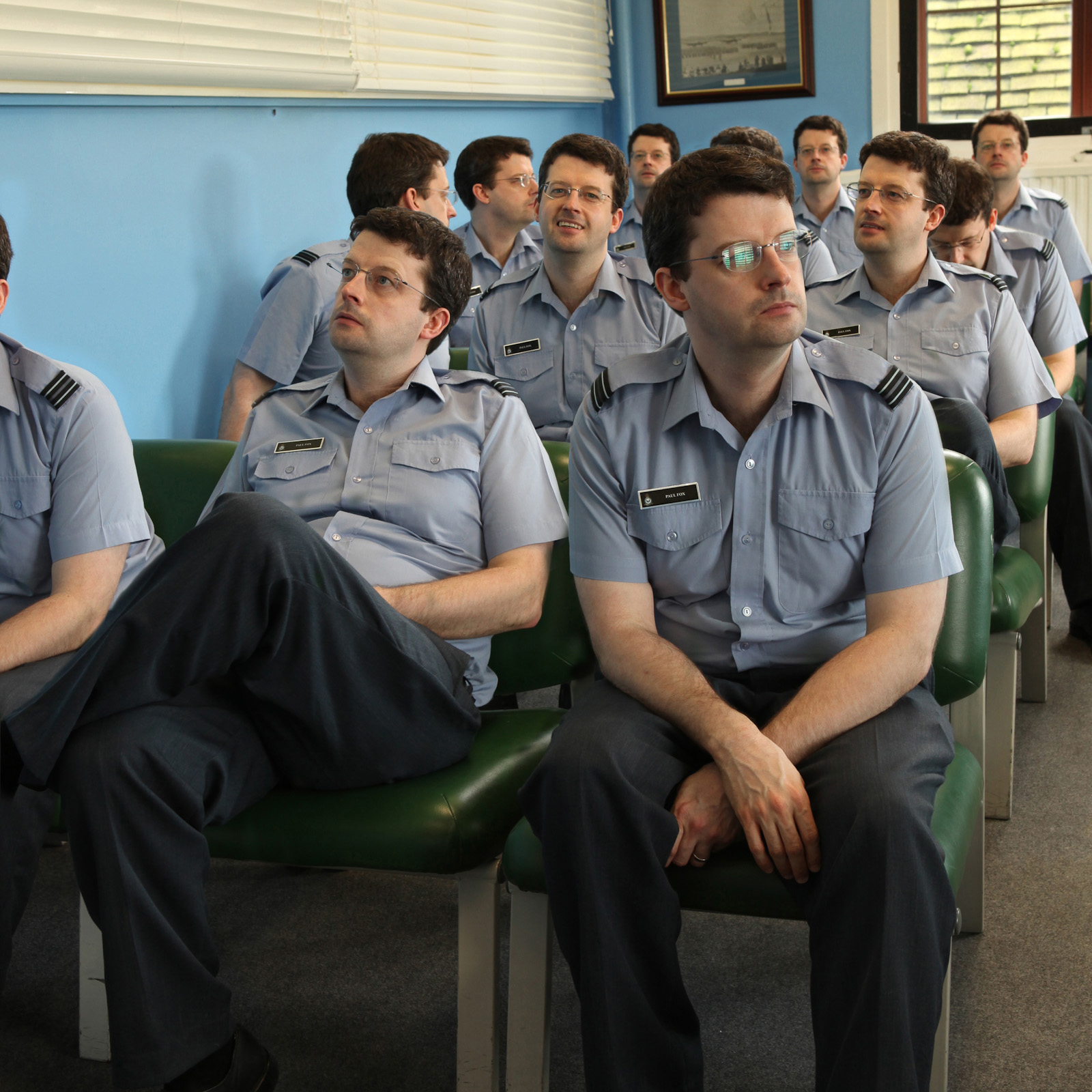
The techniques you have learnt will stand you in good stead for future projects. Advanced use of these skills mean you can produce images like this one, taken one quiet afternoon at work and created in about an hour in Photoshop from 12 different shots :)